Wednesday, September 27, 2023

Cinematography: Angle, Level, Height, Distance

 Cinematography

1. Stills From Existing Media:

1a. Still showing how angle conveys conflict, character, or development from Scream. The low angle shot is used to show that are main characters have finally triumphed over the main antagonist.
1b. Still showing how level conveys conflict, character, or development from 12 Monkeys. The Dutch shot is used to show confusion and disarray as the character is located in an asylum where one is not usually with the best mental state. 
1c. Still showing how height conveys conflict, character, or development from The Shining. The low level shot is used to show that we are now seeing things form a child's perspective and that things may be different from how others may see things. 
1d. Still showing how distance conveys conflict, character, or development from The Nightmare Before Christmas. The long distance shot shows how Sally and Jack are together with no one else nearby  so they are there specifically for each other. It also shows this moment is supposed to be intimate and just between them as we are spectating from far away.

2. Stills I Created:

2a. Still showing how angle conveys conflict, character, or development. The high angle shot exaggerates and emphasizes how small the character of Rocket. It shows why he puts his hand up as he does not want an altercation where he is at a clear disadvantage. 
2b. Still showing how level conveys conflict, character, or development. The Dutch shot is used in this still to distort the background and character in  way that amplifies the condition he is in with his senses going off very harshly. The character is overwhelmed so just like the character, things aren't seen straight.
2c. Still showing how height conveys conflict, character, or development. The low angle shot is used to emphasize the fact that both characters have some sort of way to hurt each other out without showing their facial features. It builds the tension of what the next steps of their conflict could possibly be. 


2d. Still showing how distance conveys conflict, character, or development. There is a close up on Drax and his blade shows that he is in an attacking position and ready to fight. The close up of the strike signifies the impact of the upcoming attack is going to be big or devastating as it is being built up and focused on.

3. Reflection:

During the the experiment I struggled with 3 shots. The first shot I struggled with was the angle shot as I wanted to have a high angle shot with the tip of Groot's head and the focus put on rocket. This didn't work as the camera wouldn't stay in focus so I had to have a shot were it was coming from Groot's perspective to see Rocket's reaction. I wanted the focus to show how powerless rocket felt by using the low angle but ended up having a another character added to further build that feeling. I believed it still showed how Rocket was small in comparison however and why he did what he did. The next shot was the level shot as at times I felt the effect I was trying to get was not coming out how I wanted to I had to play with other camera effects to exaggerate the background shift while having the focus still be Spider-Man and how he's feeling. Finally the last challenge was determining what distance I should be away from the subject and what that distance could possibly mean. I realized close up shots aren't as soothing and felt more dramatic which I what I decided to go for. For each of the shots I had to look back at them and really think what the character was feeling and if that matched my intention when taking the shot. I no longer was just focusing on where the viewer's eyes were going and instead on how the viewer was feeling and how it contributed to a greater narrative. I didn't necessarily enjoy nor dislike the experience but it made me for aware of how the type of shooting techniques you use affect your movie's story and audience and is something to be very aware of.

Wednesday, September 20, 2023

Mise en Scène

Mise en Scène

1. Stills From Existing Media:

1a. Still showing how contrast guides viewer's attention from La La Land. Image of Mia and Sebastian dancing. Focus is put onto Mia as she is in white which contrasts the dark surroundings.
1b. Still showing how color guides viewers attention from Spider-Man 2. Image of Peter throwing away his suit. Focus is onto the thrown away costume as it is a warm color surrounded by cooler colors.
1c. Still showing how size guides the viewer's attention from Godzilla (1954). Image of  military forces attacking Godzilla. The focus is being put onto Godzilla as the already large tanks all have to look upwards at the large kaiju standing in front of them.
1d. Still showing how frontality guides the viewer's attention from The Grand Budapest Hotel. Image of Dmitri sitting down. Focus is put on Dmitri as all other characters in the shot are wearing the same colors with the background being a mute color. However, he is put front and center so we focus on him.

2. Stills I created:
2a. Still showing how contrast guides the viewer's attention. Image of Vision providing Batman with data. The whiteness of vision contrasts with the darkness of the background and batman making him stand out. The viewer follows vision as he moves forward towards batman.
2a. Still showing how contrast guides the viewer's attention. Image of Scarlet Spider against red wall. The blue hoodie of Scarlet Spider contrasts with the surrounding redness of the character and background. His chest sticks out from the rest of the shot which draws the viewer in to that spot. 
2b. Still showing how color guides the viewer's attention. Image of Spider-Man fighting Electro on rooftop. The shot has a background full of cooler colors as well as one of the characters being highlighted by cool colors. Spider-Man's suit has the warmest colors of the shot which gets the viewer's attention. 
2b. Still showing how color guides the viewer's attention. Image of Jack-O-Lantern on rooftop. The background has a cool color scheme. The head of Jack-O-Lantern and his broom stick are orange which is a warm color. The Viewer's attention is drawn to the warm colors and focus on the top left of the shot. 
2b. Still showing how color guides the viewer's attention. Image of just regaining consciousness after getting hit by a bus. The bus in the shot is red which s a very warm color. The rest of the shot is full of darkness so the viewer is naturally drawn to the warm-colored bus that is even more highlighted by the back lighting. 
2c. Still showing how size guides the viewer's attention. Image of Rocket and Groot fighting. The low-angle shot exaggerates the size difference between Groot and Rocket. Rocket is facing and pointing towards Groot who is very tall and large in comparison which draws the viewer's attention.
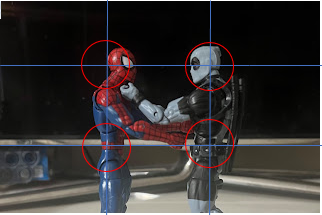
2d. Still showing how frontality guides the viewer's attention. Image of Star-Lord with Gamora and Drax in the background. Drax and Gamora are put off to the sides with Star-Lord dead in the center which draws more attention to him. Star-Lord is in the front of the shot and take sup most of the space so the eyes are naturally drawn to him.

3. Reflection:
During this process, I faced a couple different challenges. The hardest part I believe was distinguishing contrast and color. As you can see in two of my color stills, there is red on blue which a big contrast. I wasn't sure if my eyes were focused on these points because of the warmth of the colors or because that's where the contrast took place. For that reason, I added more to each section so that red and blue weren't the main colors for both. I had a black and white contrast in one still and red on black for my color still. I also took the size image multiple times at different angles. It never felt as though Groot was big enough and when he was, the shot just didn't look that appealing. I also had to take away from the fact that rocket had contrast and warm colors on him so I covered it by giving him something to hold. Finally In the formality still, Drax was sticking out a bit too much so I brought Star-Lord more forward, brought his arm up to cover Drax, and blurred the background so that it was easiest to focus on Star-Lord. Overall I enjoyed the experience but found it stressful. Trying to get that perfect shot forces you to think. You have to put yourself in the audience's shoes and think about what you can do to achieve your goal. It takes many reshoots in order to get your desired affect and changes that you weren't planning on to elevate your shot. Sometimes your final shot doesn't come out the way you want and that is okay, but you should never stop trying to get it as perfect as you can. 

Tuesday, September 12, 2023

Rule of Thirds

 The Rule of Thirds
    Recently in class, we went over how films generally follow something called the rule of thirds. This is when scenes are shot with subjects and landscapes aligning with imagery vertical and horizontal lines that lines up with the first and second third of the shot and how it can be used to strengthen the narrative.

   1-Still from film demonstrating how the media creator used "The Rule of Thirds" to suggest plot/character development. This image is a still portraying a conflict between Hit-Girl and Frank D'Amico on the vertical third lines and within intersecting points from the movie Kick-Ass (2010)


5aThis image depicts tow characters from the movie aligned along the vertical lines of the grid. Notably, the image is of one of the protagonists and the main antagonist of the film. The character on the left (Hit-Girl) is taking up a majority of the frame as she has her body and arms in the space behind and in front of her. The character on the right (Frank D'Amico) only takes up a third of the frame with his arms entering hit girls frame as well to establish that there is something that is going to happen between the two. Frank's head is also placed directly on the lower right intersection while Hit-Girl's fist and head are positioned near the upper left intersection to show how she is currently in control of the situation. Frank is the man who destroyed her father's life and was the one who got him killed. It is this shot where we can see Hit-Girl take control over the man who previously had control over her life. It signifies her trying to take control of her life again. Her growth is seen through initiating the climax of her story by showing it was her who decided to do something against Frank while he is the one who is no longer in control, which has been untrue for the rest of the film. 


2a-Places/Settings/Landscape taken without regard for the rule. The image is of a fountain in a yard with no distinct part shown to follow either the horizontal or vertical third lines.


2b-Place taken with the horizon correctly aligned with the horizontal rule line, and focal objects lined up with hot spots. The image is of the landscape on the side of a road in a neighborhood. A tree and fountain are aligned with the intersections of the horizontal and vertical lines the background lines up with the bottom horizontal line and beginning of horizon lines up with top horizontal line.

3a-One figure taken without regard for the rule. The image has the character placed directly in the center with nothing on the vertical third lines and the background not laying on a horizontal line.


3b-One figure taken with the object figure aligned with hot spots on either vertical line. The image has the character aligned with the first vertical third line with his head placed on the top left hot spot (intersection).

4a-Two figures taken without regard for the rule. The image has neither character aligned with the intersection of the vertical and horizontal lines. Landscape not directly aligned with horizontal third lines.


4b-Two figures taken with eyes and landscape aligned according to the rule and figure have neutral spacing. The image has both characters aligned with the vertical third lines. One character has their eyes in line with the top horizontal line on the top left hot spot while the other has them aligned with the bottom horizontal line on the bottom right hot spot. landscape is aligned on the bottom horizontal line. Characters are spaced evenly apart as to not intrude the others space.


4c. Two figures taken with eye and landscape alignment and vertical placement to suggest attraction. Both characters are aligned on the vertical third lines with both their eyes on the top horizontal line and the landscape aligned with the bottom horizontal line,


5b. My image portrays the narrative that there is an attraction between two figures using the Rule of Thirds. For one, my subjects are aligned with the neutral lines of the frame which is also where the horizontal and vertical lines intersect. These intersections are known as the hot spots and is where are focus mostly lies on. The characters are both leaning in towards each other to signify that something is going on between these characters. To show that the characters are on the same page, I made sure their eyes aligned with each other on the top horizontal third line. This also helps boost the idea that they have some sort of deep connection as they are maintaining deep eye contact. To show further attraction I made sure to move their arms towards the hot spot of the other character being the head and hips. These are areas that can be tied with affection and by moving a character toward those areas you can build the narrative that the character is affectionate towards the other. By having both characters do this you can see that the affection is mutual and that two figures are showing attraction for one another. 


4d-Two figures taken with eye and landscape alignment and vertical placement to indicate conflict or threat. The image has both figures still aligned with the vertical third lines. Landscape more aligned with the top horizontal line. The eyes of both characters are aligned with the top horizontal third line but placed at slightly different elevations to show the characters are not on the same page. One character is lunging forward and taking up about 2/3 of the frame while the other is moving back and taking up about 1/3 to create the feeling that the character is being backed into a tight spot to create a dramatic and threatened feel. 

Wednesday, September 6, 2023

Introduction to Me

 HELLO WORLD!

I go by J. Bot and this is my blog. 

I am a Junior in high school who has enrolled in the AICE Media Studies course.

I am taking my first steps into the world of film through the AICE Media Studies course and will be discussing the world of media and media production. I've always loved storytelling and how it works in tv shows, movies and literature. I have a love for comics and novels, video games, music, and, I think most importantly, film. I enjoy playing fighting games or beat 'em ups and also RPGs. My favorite artist include MF DOOM, Tyler, The Creator, Mac Miller, and various others. I love swimming as I find it clam and relaxing and so I always enjoy going to the pool and the beach occasionally.   Growing up, I was always enamored by the world of superheroes and comic books. So, the earliest forms of media centered around superheroes. This included animated tv shows, books, and most importantly, movies.


Characters that I thought I could previously only find in a book were brought to life before my eyes. It was like magic. Movies were like their own form of magic. I then realized movies were a creative outlet that allowed for anything to be possible. They transported you to a different world, almost like a alternate dimension, and evoke feelings and emotions in you that you may of not thought you would have felt. In school you learn about storytelling, genres, themes, and the different conventions of text and film is able to convey all these things without saying a word sometimes. 

My favorite types of stories have always been coming of age stories. I've always loved seeing how a character can grow in an organic and fluid way and what events the story throws at them in order for them to do so. My favorite coming of age film will always be the Karate Kid. The protagonist is in a completely new environment, relationships are complex and not just the common tropes that they appear to be on the surface level. I believe it does everything right in what it is trying to accomplish. 

Production Portfolio: The Final Cut